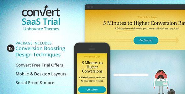
Selling a Web App or Software as a Service?
This multi-purpose Unbounce theme uses 18 different conversion centered design techniques to drive the eye towards trust building testimonials, video demos, screenshots, CTA’s and more.
Use the original PSD to customize graphics and icons to fit with your brand’s color scheme. It takes only a few minutes to make these changes in the PSD or in Unbounce.
Features:
- 18 different conversion centered design techniques to amp up sales
- Instructions on how to customize the image slider
- See live previews
- Mobile Version
- Desktop Version
Package Includes:
- 1 Desktop Landing Page themes
- 1 Mobile Friendly Landing Page themes
- 1 .unbounce file for easy uploading of theme to Unbounce
- All original artwork in PSD format
- Theme documentation and usage
18 Design Techniques to Drive Conversions
- Bold offer with underline that ties into the copy on the CTA button
- Contrasting color on CTA button makes it stand out
- Arrow underneath the button it direction the eye to the button and implies “onward”
- Video overlap ensures that the visitor can tell there is more to see below the fold
- Line from video draws the eye to the testimonials
- Success stories stated as “1 of 200” lets your visitor know you have 199 more testimonials you didn’t have room for on the page
- From your testimonial quotes, pull out some text that will address users objections or hesitations
- Try to get quality photos of people who have given testimonials
- Here you can list the full testimonial for those who want to read it
- Arrows draw eye back down to another CTA
- If you’re selling a web app, you may want to show previews on a laptop
- Sometimes you need to clearly state the benefits. This 3-col layout will help with that.
- Another directional queue to the next piece of content
- This image slider gives you the ability to highlight features of your web app, without linking them to a popup or off the page
- Gotta have social proof! This page includes an area to include a customizable Twitter feed widget.
- Pull out your favorite Twitter comments to highlight on the left so visitors don’t have to read the feed.
- Another directional queue down to a different layout for features, benefits or other content.
- Arrow back down to the final Call to Action. If you haven’t sold them by now, you’re not going to.

- Another bold, underlined offer to accompany the CTA button copy
